On digital design, the acceleration of time, and the disappearance of rhythm
ESSAY
March 2025
Digital interfaces are structured around gaps—not just in layout, but in time. Visually, these gaps appear as margins, paddings, and the space between elements. They help organize hierarchy, clarity, and focus. But there are also temporal gaps—pauses between actions, delays before something appears, moments where we wait, if only for a second. These intervals may seem trivial, but they are carefully designed and continuously optimized. Though often imperceptible, they shape how we engage, how quickly we process, and whether we stay or move on. In both visual and temporal terms, these gaps control rhythm. And rhythm, more than speed, is what determines how we experience meaning.
Designers make micro-adjustments in interface spacing not only for clarity, but to influence momentum and control pacing. On a social media feed, the transition from one post to the next is rarely abrupt—it's softened by just enough space to encourage continued motion. These spaces aren't passive; they manage attention. The absence of interruption keeps us scrolling, and the rhythm of that scroll is crafted to feel seamless. In this way, interface gaps choreograph how long we stay, how quickly we move, and how little we notice that we never truly pause.
Digital interfaces today are designed to minimize friction and erase transitions. In this environment, experience itself becomes fragmented. Actions are no longer separated by physical or temporal distance; one click collapses into the next. As transitions disappear, so too does the continuity that once shaped how we thought.
Microsoft
Windows XP Loading Screen
The Windows XP loading bar represents an early form of engineered waiting in digital environments. It's already not a secret that the visual progression does not accurately reflect system processing; rather, it is designed to produce an illusion of smoothness and control. I still remember seeing this screen almost every day when I turned on the computer—a small ritual that marked the beginning of time spent online. What seemed like a neutral moment was already part of a larger strategy: to reframe user inaction as an active stage within the digital flow.
Matthew Ström discusses in UI Density that density not only as a visual strategy but as something temporal: how information accumulates over time, how moments connect.1 Digital interfaces aren’t just layouts; they’re timelines. The scroll isn't just downward—it's forward, accelerating us through content, compressing the time between impression and reaction. But these design decisions do more than organize screens. They condition our perception of time.
What happens when transitions disappear? In the physical world, time stretches across space. We used to move through thresholds—waiting for a show to air once a week, commuting from home to work, or walking from one room to another. These intervals weren’t just logistical; they created rhythm. There was a balance between anticipation and arrival, between the journey and the destination. The in-between was part of the experience. But in the digital world, time is compressed. Interfaces are designed to remove friction, to eliminate the wait. We no longer transition—we are already there. The moment we tap, content appears. We don’t depart and arrive. We are dropped into outcomes, one after the other.
Nowhere is this more apparent than on social media. Within ten minutes, we can see updates from fifty people—where they are, what they’re eating, what they’re thinking. But these fragments of lives, stitched together by a feed, replace what once took hours, days, or even months to encounter through conversation or proximity. There was once a time cost to learning about others. I'm not talking about the time when people send physical, but more recently: phone calls, text messages, a time when we need to go to them and start a conversation. Now those interactions are collapsed into flashes of visibility. We are flooded with presence, but without encounter.
THE DISAPPEARANCE OF TRANSITION

Instagram User Interface Design (of course the first thing I see is an ad)
Instagram’s interface is carefully designed to sustain user engagement by eliminating moments of pause. The vertical feed shows only partial images or videos, encouraging continuous scrolling. The top row introduces horizontal interaction—ephemeral Stories that expire in 24 hours, and Reels that autoplay short videos—each engineered to prompt habitual checking and rapid consumption. These micro-interactions are not random; they’re calculated touchpoints that keep users within the app. Even the transitions between content, once a space where loading might occur, have been optimized away. In tests, I was able to scroll through seven Reels in under two seconds, without encountering a single loading screen. What appears seamless is in fact highly managed—designed to reduce friction, extend screen time, and remove the very idea of waiting.
(Sometimes I wonder if this smoothness is why I forget what I’ve just seen because there was never time to register it.)
Physically, especially since the shift to remote work during COVID, I’ve noticed how the space between things has disappeared. Back-to-back Zoom meetings leave no time to reflect, reset, or breathe. Transitions are compressed or entirely eliminated. The middle has been removed.
I also remember waiting for a weekly show to air—Saturday at 8 pm. That rhythm gave shape to time. The show had a beginning, a middle, and an end. Life happened around it. Today, the algorithm delivers what we might want before we even ask. We no longer arrive; things arrive at us.It’s easy to mistake this abundance for freedom. But sometimes, I wonder if what I miss is not content, but cadence, a sense of pacing that includes absence, not just presence.
00s TV schedule
A printed TV schedule from a Taiwanese newspaper, listing programming by time, channel, and genre. In the era of broadcast television, viewers shaped their lives around these grids—waiting for a show to start, planning ahead to catch a specific episode. In many cases, the waiting time was longer than the actual program. This image captures a media environment where both time and attention were structured by rhythm and anticipation. Unlike today’s digital platforms, where content is instantly available and endlessly scrollable, older formats foregrounded the gap between now and next—making waiting a fundamental part of the experience.
Despite the increasing speed and optimization of digital systems, traces of waiting have not entirely disappeared. Moments of latency—throbbers, lazy loadings, loading bars—still surface, though they are rarer and more carefully managed. These brief interruptions reveal a structural limit that seamless design cannot fully eliminate.
As Jack Self argues in Beyond the Self, throbbers are artifacts of a system struggling to maintain the illusion of continuous flow.2 They signal that real-time is not absolute, and that delays, however compressed, persist at the core of digital experience. The function of the throbber is not simply to inform users of delay but to manage their perception of it. Designed to sustain user attention without rupturing the overall experience, the throbber reframes non-action as part of a normalized, ongoing process. According to Self, the critical threshold for user patience is approximately two seconds, “Beyond this time the throbber is unable to hold the subject’s attention and the entire illusion of smoothness breaks down.” Within this narrow window, the throbber becomes an element that mollifies dissonance, stretching the user’s tolerance just enough to maintain engagement without revealing the system’s underlying fragility. More fundamentally, the throbber participates in sustaining the ideology of real-time itself.
Colleen Bushell
NCSA Mosaic’s throbber
Early 1990s
This is the earliest development of a throbber, which featured an NCSA logo that animated while Mosaic downloaded a web page.
Digital infrastructures promise immediacy and seamlessness, but what they produce is an elastic fictionm, an architecture that masks the structural inequalities, delays, and fractures inherent to global information networks. Even at the speed of light, large distances generate latency. No amount of optimization can abolish this basic physical limitation. The role of the throbber is to conceal this reality, ensuring that users remain within the system, believing in its coherence. As Self stated, in this synchronized space, the subject is no longer treated as an autonomous being but as a node within an optimized network. Individuals are reduced to bundles of extracted preferences and behaviors, continuously compiled, compared, and analyzed. The self is fragmented, its coherence dissolved into a collection of marketable data points.
The logic of real-time is not merely about speed; it is about restructuring human experience into something that can be captured, parsed, and exploited. To encounter a throbber, therefore, is to encounter a limit—not merely of the system’s technical capacity, but of its ideological ambition. In these fleeting moments, the system’s seamlessness falters, and the user is briefly returned to the experience of waiting. This return is not insignificant. It opens a possibility: that time might still be encountered as duration rather than as flow, as lived experience rather than immediate reaction. In a culture that seeks to erase transitions to maintain control, designing for hesitation becomes a way to reclaim time as something resistant and human.
Apple
Spinning Pinwheel, OS X El Capitan
2015
A variation of the mouse pointer used in Apple's macOS to indicate that an application is busy.
Infinite scroll was invented in 2006 by designer Aza Raskin and was added to Facebook in 2011, followed by Twitter and Instagram in 2016. The implementation of algorithms now allows users to view content tailored to their interests, rather than seeing posts in chronological order. Like I wrote in the introduction of this book, turning to the last page of a book and finding a blank page signifies an end. It gives a moment to pause, reflect, and replay everything I’ve read in my mind. But now, we’re so accustomed to receiving information passively. Machines deliver contents we (might) like by tracking our browsing data. It has become a habit that we expect that as soon as we open our apps, we will see content that will likely entertains us.
Raskin issued a warning at a tech gathering in 2019: tech giants are creating the cultural equivalent of climate change.3 Raskin spent years in technology industry and believed that he was changing the world in a good way, but things did not go as he hoped. In an interview, he said, “Humanity is living through ‘two super old stories. One: be careful what you wish for, because you'll get it... And two: creators losing control of their creations.’” The common goal of people in tech is to bring progress, to provide a better life for human beings. However, now technology has started to bring damages to us mentally and culturally. “Addiction, distraction, disinformation, polarization and radicalization; all these ‘hurricanes’ have one common cause. They come from the fact that we now spend large portions of our lives inside artificial social systems, which are run by private companies for profit.” Raskin argues.
Ruben Pater conducted extensive research in Caps Lock to uncover the connections between capitalism and graphic design.4 He mentioned how tech companies use graphic design to manipulate and shape human behavior for profit. He pointed out that UX designers deploy legions of tricks to keep users on websites as long as possible. Infinite scrolling, dark patterns, and auto-play, are some of the tactics that designers have copied from the gambling industry to keep us hooked to our screens. Technology companies use UX design strategies to make people addicted to their smartphones.
The speed of our technology devices have become faster and faster. If you follow the updates of Apple products, you’ll notice that each launch emphasizes improved performance (instead of the visions Steve Jobs used to give us.) People are losing patience on the internet. It used to be normal to wait a couple of minutes for a computer to turn on or 10 seconds for a website to load. Now, if we wait more than two seconds, we assume our devices are broken. Tech companies are well aware of this shift, and they’ve found ways to monetize our impatience.
Steve Jobs introducing iPod
2001
Jobs famously shaped product launches through simplicity. Rather than describing specifications, for his iPod presentation, he framed experiences—“1,000 songs in your pocket”—allowing users to imagine possibilities of having the product rather than being told what to value.
Technology gives us the illusion that we have control in our lives by giving us more choices, while reducing our agency. Former Google product manager Tristan Harris wrote in his essay, How Technology is Hijacking Your Mind, “The more choices technology gives us in nearly every domain of our lives (information, events, places to go, friends, dating, jobs) — the more we assume that our phone is always the most empowering and useful menu to pick from5.” He also adds that autoplay features—common on platforms like Netflix, YouTube, and Facebook—further diminish opportunities for users to consciously pause and make decisions. These platforms eliminate moments of reflection, keeping us locked in a cycle of continuous content consumption. Feeds are purposely designed to auto-refill, and eliminate any reason for users to pause, reconsider or leave. Moreover, our time spent on digital products become just data to tech companies that serves business interests, while they claim that they are helping people to have better, easier lives where we can see what we want.
The pauses between content is minimized to prevent users from stepping back and reevaluating their engagement. Tech companies have not only filled our temporal gaps between events but commodified it. The moments that once allowed us to reflect and contemplate have been replaced by seamless digital experiences designed to keep us hooked. In digital platforms, our personal time is no longer ours—it’s a commodity that tech companies want to control.
Autoplay button
Now a default feature on Facebook, YouTube, Netflix, and more, autoplay is designed to extend screen time. More time spent means more revenue—turning user attention into a directly monetized asset.
Take YouTube as an example—a platform that used to be a totally free for people to share video content, until 2007 when they started to add advertisement to the videos. Advertisements are prominent interruption to users’ experiences on YouTube. Later on, YouTube started to introduce longer and unskippable ad formats, people become more and more annoyed by the interruptions. We all know the next story. YouTube then launched a subscription-based membership that allows users to watch videos without any ads. This is a clear example of the commodification of intervals. Tech companies have conditioned us to expect uninterrupted, infinite entertainment. They minimize our moments of lingering—the moments of pause or reflection—until we are so accustomed to continuous content that we feel annoyed when an interruption occurs. Then, they profit by offering solutions to the very problem they created.
I had a conversation with Shun Chen Hsieh, a 29-year-old product desiger, shared to me his experience with YouTube, a platform he has actively used for over a decade. Reflecting on the changes he’s witnessed, he said, “Nowadays, with longer videos, there’s almost always an ad. If the video is over a certain length—initially, the threshold was around three minutes to make profits, and later on, it became six or ten minutes—creators aim to fill content to reach that length. Later, they even started incorporating sponsored content as part of this runtime. So, they’re earning from the runtime itself and from sponsorships. It feels like everything has turned into an ad. In my mind, I’m just like, ‘Help! I’m not buying anything—stop selling to me!’”
Hsieh’s reaction shows how corporations infiltrate every small fracture of time to extract profit. YouTube, which once encouraged creativity and sharing, has gradually transformed into a space where creators must tailor their content to fit platform restrictions. There was a time when YouTube was fun—a place for people to share diverse, less controlled stories. Then came the monetization, which attracted a flood of content creators hoping to profit from their videos. But as YouTube introduced stricter rules, making money on the platform became harder. Creators had to produce longer videos to meet the minimum length for profitability, often diluting the content’s meaning or fun. Sponsored segments—sometimes over a minute long—interrupt videos, promoting products irrelevant to the main content. When I asked Hsieh about how YouTube feels now compared to five years ago, he remarked, “It’s hugely different. Ads have invaded every little gap in platforms meant for social interaction or entertainment. It feels like they’re crammed into every possible space.”
YouTube’s ad formats
2025
Today, YouTube integrates multiple types of video advertisements—skippable, non-skippable, and bumper ads—into user experiences. These ads commodify the pauses between videos, turning transitional moments into opportunities for monetization.
credit: YouTube
YouTube’s strategy of content control may appear less aggressive than outright censorship, but it is arguably more effective. y using algorithms and infinite scroll, platforms like YouTube keep users within their comfort zones, feeding them similar content over and over. But while this lack of diversity in what we see is troubling, there’s an even more alarming issue: the narrowing of content creation itself.In a society increasingly accustomed to passively receiving information rather than actively seeking it, the homogeneity of content creation becomes a self-reinforcing cycle. Creators, driven by trends and demonetization, churn out similar content to maximize views and likes. When a trend emerges, thousands of creators jump on the bandwagon, further eroding the diversity that once defined the early internet.
I also talked to someone a bit younger. Peng, a 24-year-old graduate student studying Computer Science at New York University, shared his experience with social media. As a Gen-Z, growing up in an era where smartphones and social media were already ubiquitous, Peng has little memory of a time when people lived without smart devices. “I pick up my phone whenever I’m not doing anything,” he said. “I don’t even think about what I want to see or why I’m doing it. It’s just a habit—I have to use it when I’m not busy with something else.” I asked him if there were moments when he finished his work and simply relaxed, doing nothing. He seemed surprised by the question. “Just sit there and do nothing? No, that never happens,” he replied.
Curious, I pressed further: what if he only had two spare minutes—would he feel uncomfortable if he couldn’t pick up his phone? Peng responded, “I can’t even imagine that happening because it just doesn’t exist in my life. If you have two minutes, you can always pick up your phone.” I asked him to picture a scenario where his phone wasn’t nearby—would he feel anxious? After pausing to think, he said, “I don’t think I’d feel anxious, but I would feel like I wasn’t using my time properly. Like, I could’ve spent those two minutes looking at my phone, finding something fun. Why would I waste it just sitting there doing nothing? It feels like missing a chance to do something.” Peng’s response intrigued me. It revealed how deeply his habit of using smart devices to fill every gap in his day had become ingrained. When I asked if he felt the content he consumed on social media benefited him in any way, he replied bluntly, “No.” So why does he keep looking at his phone, knowing it offers nothing beneficial? “I just feel like I have to find something to do in that moment, and my phone is right there. When I was younger, before smartphones were popular, I didn’t have that option. But now it’s so convenient—I can check it even if I only have one minute. I don’t think, ‘Oh, one minute isn’t enough time to watch a TikTok video.’ There’s always time for a TikTok.”
TikTok’s integration of advertising into user content
2022
TikTok embeds ads to resemble native full-screen videos, making commercial content often indistinguishable from personal posts. Through strategies like the hashtag #TikTokMadeMeBuyIt and collaborations with creators, TikTok blurs the boundary between entertainment and marketing, turning user engagement into direct consumer behavior.
credit: The New York Times
The convenience and accessibility of smartphones, combined with the quick, bite-sized nature of platforms like TikTok and Instagram, have created a constant portal to vibrant, immediate content. Whether you have one minute or one hour, these platforms are designed to fill the time effortlessly. “Easy to use” was once the goal of tech companies in designing their products, but now these tools have become too easy—so much so that they infiltrate every moment of our lives. Peng reflected, “When I’m chilling, I always need to find something to do. I might clean my desk if I have time, but that doesn’t make me as happy. My phone gives me more excitement, so I usually pick it up without even thinking.”
Social platforms compress the user experience into an endless feed, making pauses a design choice. Platforms are designed ensure that users stay engaged, seamlessly moving from one post to the next. According to Jonathan Crary, this relentless flow of information is a symptom of our society’s obsession with productivity and efficiency.6 In 24/7, he writes, “Billions of dollars are spent every year researching how to reduce decision-making time, how to eliminate the useless time of reflection and contemplation.”
This constant exposure to possibilities—to what others are doing, making, achieving—fills our minds with futures we haven’t chosen and limits our own possibilities. It’s about losing the structures that once allowed for staying with something unresolved. When every moment is designed to deliver, we forget how to wait. Crary describes a world where sleep, once the final boundary, is no longer sacred. The drive toward continuity, productivity, and stimulation erodes our limits. We no longer stop. And when we do, we feel guilty.
The gaps between actions—the spaces where waiting once happened—are increasingly rare. Digital systems, driven by capitalist incentives, are designed to minimize interruption and maximize continuous engagement. Where transitions once allowed us to experience time passing, today’s interfaces compress these intervals into near invisibility. What remains is not a rhythm, but a constant state of activity—a continuous present optimized for attention, stripped of duration.
German Philosopher, Byung-Chul Han, in The Scent of Time, writes: “Time is lacking a rhythm that would provide order, and thus it falls out of step.” We don’t just live quickly; we live without sequence.7 The future and past collapse into a continuous now. Han’s statement describes how the our perception of time is accelerated by the larger amount of images and information, and the shorter interval we encounter every day. He calls the internet space “a space without direction,” where has no finality, and everything is kept in limbo.
On the internet, threads and threads of infinite text and images diminish our chance for lingering contemplation. Contemplation leads to generation and understanding of knowledge, but in the current society, it’s more difficult to perceive it. How we “browse” the internet instead of reading is a form of movement that is not linked to a direction, and there is no any fixed path. Han writes his abservation about lingering on the internet, “When intervals become shorter, the rate of succession of events accelerates. The compression of events, information and images makes it impossible to linger. The furious pace with which successive images pass does not permit any lingering contemplation.”
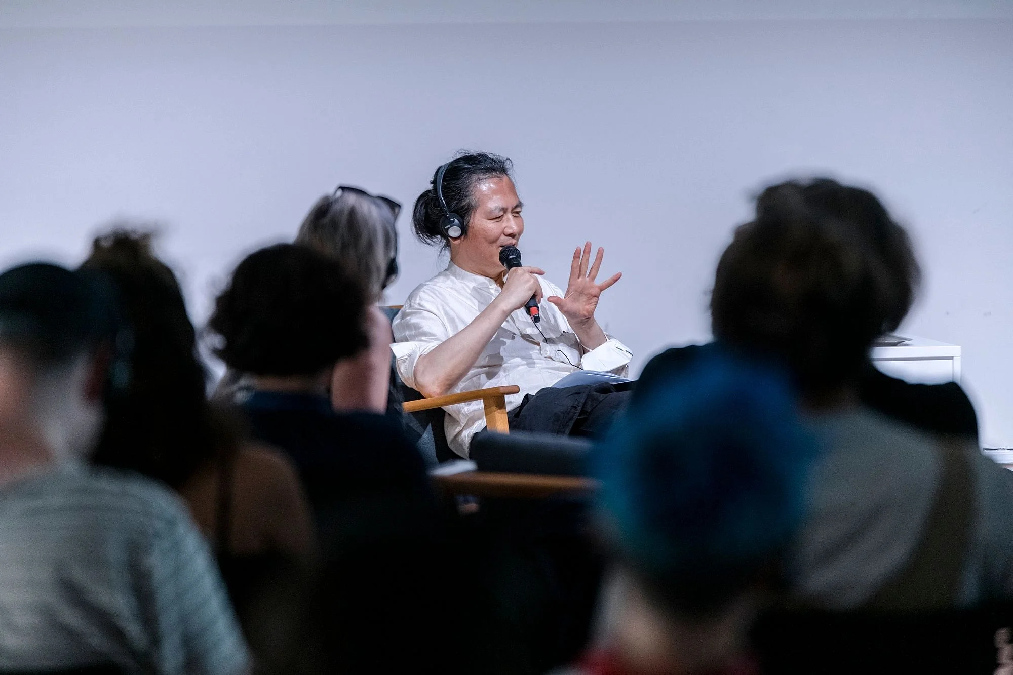
Byung-Chung Han speaking at MOME
2022
In the Scent of Time, Han diagnoses the collapse of temporal structures in contemporary life, where speed, simultaneity, and constant activation dissolve experiences of sequence, duration, and meaning. His reflections on the loss of rhythm and the fragmentation of time heavily inform this essay’s inquiry into how design, digital interfaces, and capitalist systems have accelerated human perception—and what might be lost when lingering, waiting, and dwelling are erased.
credit: MOME
The current situation of digital experience is a kind of temporal overcrowding: a pushing and shoving of images, updates, and events, all demanding our attention at once. This endless production does not allow time to settle. Instead, it fragments it further, creating a world where we zap through everything, unable to dwell. The scroll becomes our structure. And yet, Han also reminds us that time, when opened, can become a site of possibility. “Waiting becomes passion,” he writes, “if the temporal interval which separates the present from the expected future expands into the open.” Waiting, in this sense, is not just absence but expectancy. The time between departure and arrival, though uncertain, can be a space of hope. But when everything collapses into a single, flattened now, we lose the chance to inhabit that expectancy. We are no longer waiting—we are refreshing, updating, reacting. We no longer move through time.
Design becomes the architecture of our attention. And increasingly, it is built without the temporal interval. I think about this often, not as a technical flaw, but as a loss I can feel. There are moments when I catch myself wishing for a walk, a breath between one thing and the next. But what if we brought them back? Not every space must be filled. Not every moment must be answered. Some things only become visible in the pause. Some rhythms can only be felt in the delay. To linger is not to fall behind. It is to stay with. To stay long enough for meaning to surface. Design can hold that space.
Jenny Odell, in How to Do Nothing, speaks to this idea of lingering as resistance.8 She connects the erosion of attention to a broader cultural system—one shaped by capitalism, colonialism, and ecological harm. While her critique is expansive, what stays with me is her insistence that certain things—like slowness, stillness, and non-utility—are not useless, but essential. In a world that reduces value to productivity, these “non-actions” become quietly radical. I return to her words because they remind me that lingering is not the opposite of engagement. It is a different kind of presence—one that resists being measured, optimized, or turned into output. In that sense, to linger is to reclaim time as lived. That’s what I hope design can still do.
My art practice are ways of extending the questions I’ve explored so far. They are not meant to resolve, but to dwell inside uncertainty. They propose a different kind of engagement, one that values delay, ambiguity, and duration over speed and clarity.
1kbps asks whether digital interfaces can still make space for slowness. The project draws from early 20th-century Japanese textile patterns and introduces them into a UI environment, deliberately slowing down transitions and interactions to create a fragile, contemplative rhythm. It imagines what it means to pause inside a system optimized for speed. The project also draws on John Locke’s An Essay Concerning Human Understanding, especially his ideas on empiricism and how knowledge is formed through experience.9 It is a meditation on the beginning of thought, and the spaces in which thinking can still take place.
Chi Hao Chang
1 kbps
2023
1kbps is an immersive installation that explores how moments of pause can still exist within a world of seamless digital acceleration.
I attempt to recompose short pauses on screens alongside the pauses we find in nature, asking whether, even here, contemplation is possible.
In Gen-Zisyphus, I turned to the myth of Sisyphus and reimagined it through the lens of social media. I used ceramic vases—a medium of permanence—to record the fleeting, rapid-fire imagery of scrolling culture. On the surface, it depicts a looping cycle of labor and comparison, like Sisyphus eternally pushing his stone. But underneath, it’s about something else: about whether pausing, reflecting, and even resisting this loop is still possible.
Chi Hao Chang
Gen-Zisyphus
2024
Gen-Zisyphus reimagines the myth of Sisyphus within the context of the internet culture. I was drawn to the endless loops we create online—scrolling and wondered whether our gestures today are so different from Sisyphus rolling his stone.
21st Century Illumination extends this inquiry into public space. The project reimagines streetlights, once inventions of safety and commerce, as beacons of digital attention. Each sculpture replaces a traditional lamp with a glowing phone notifications and applicaiton icons. Rather than lighting our streets for protection or orientation, these new lights reveal what now illuminates our nights: not sodium bulbs, but the endless presence of updates. The project asks: What truly keeps us awake? What defines being visible, active, or present in the twenty-first century? In a world where attention has become the dominant form of currency, these glowing icons point not only to our devices—but to the disappearance of darkness itself.
Chi Hao Chang
21st-Century Illumination
2024
In 21st-Century Illumination, I asked myself: what lights up our nights today? This work continues my exploration of how technology reshapes the rhythms of daily life, pulling us into a cycle of attention that never fully turns off.
Each of these works creates an interruption. A glitch in the optimized flow. A moment to hesitate. But more than that, they offer a space to think—a small clearing in the noise where contemplation might happen. They don’t demand interpretation. They don’t deliver answers. They invite you to stay a little longer, to feel your own presence in time. They are also acts of critique. In different ways, each project questions the systems we move through—systems that reward speed, visibility, and productivity at all costs. They ask what we lose when we are controlled by technology. And they try, however quietly, to push back. Against the logic of acceleration. Against the erosion of attention. Against the shrinking of time. In that lingering, maybe something real can take shape.
There are fewer places left where we are allowed to wait. In most of the systems we inhabit, time must flow forward without interruption, without uncertainty. Even a minor pause can open a breach—a place where something else might happen. Through my work, I search for these breaches. I believe that in moments of slowness, we are not only resisting the logic of efficiency; we are returning to a more human scale of time. A time that leaves room for memory, for imagination, and for simply being.
1 Ström, Matthew. UI Density: What UI density means and how to design for it. 2024 https://matthewstrom.com/writing/ui-density/
2 Self, Jack. Beyond the Self. (e-flux Architecture: Superhumanity, October 2016) https://www.e-flux.com/architecture/superhumanity/68658/beyond-the-self/
3 Dodds, Io. ‘We lost control of our creations’: The Silicon Valley heretic on a mission to make Big Tech repent. (The Telegraph, 2019)
4 Pater, Ruben. CAPS LOCK: How Capitalism Took Hold of Graphic Design, and How to Escape from It. (Valiz, 2021)
5 Harris, Tristan. How Technology is Hijacking Your Mind—from a Magician and Google Design Ethicist. (Medium, 2016)
6 Crary, Jonathan. 24/7: Late Capitalism and the Ends of Sleep. (Verso, 2013)
7 Han, Byung-Chul. The Scent of Time: A Philosophical Essay on the Art of Lingering. Translated by Daniel Steuer. (Polity Press, 2017)
8 Odell, Jenny. How to Do Nothing: Resisting the Attention Economy. (Melville House, 2019)
9 Locke, John. An Essay Concerning Human Understanding. (1694)