Identity for the Taiwanese film studio capturing reality from distinctive perspectives
FREELANCE PROJECT
Brand Identity
art direction
Motion Graphics
strategy

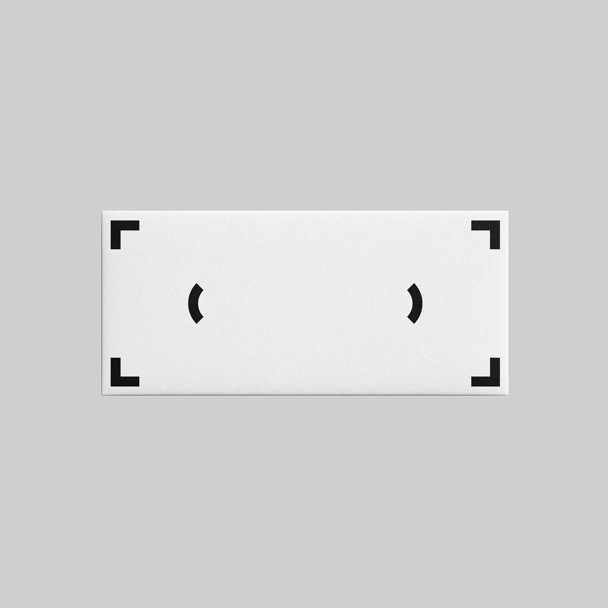
23 Film is a Taipei-based film studio with a distinctive cinematic voice. Inspired by the graphic language of camera viewfinder frames, the identity system reinterprets geometric elements to form a custom numerical wordmark. These minimalist yet intentional forms signal the studio’s focus on visual storytelling, while the subtle tilt in the focal point reflects its commitment to framing narratives from unexpected angles.

Inspired by the graphic language of a camera viewfinder, the wordmark deconstructs and reassembles its framing lines to form the number 23

The visual language of the identity draws from the graphic structure of camera viewfinder frames—forms visible only through the eye of the cinematographer

Letters from Sweden’s Rund is used as the primary typeface, echoing the visual language of the identity system. Its concave terminals, reminiscent of shapes carved from a large circle, mirror the logo’s emphasis on negative space. The Chinese typeface, Noto Sans, offers a cohesive complement to the English characters
An animated studio intro designed to precede 23 Film’s productions. The sequence centers on the tilted focal point from the logo, translating it into motion to reflect the studio’s commitment to unconventional perspectives in filmmaking
Beyond visual identity, I worked closely with 23 Film to develop a brand strategy that clarified the studio’s voice, messaging, and position. This strategic foundation shaped a flexible design system rooted in the modular forms inspired by the camera viewfinder. The system is designed to adapt across various formats, allowing for expressive combinations of typography and imagery. The identity communicates 23 Film’s vision: to frame reality through an unconventional lens. The tilted focal point acts as a visual metaphor for the studio’s approach to storytelling, where perspective becomes a tool to uncover overlooked narratives.

Messaging like “The Shots of Reality” was developed alongside the art direction and typography, integrating brand language with imagery and graphic elements to express 23 Film’s voice

The identity extends into photography and layout, using tilted framing to echo the off-center focal point, reinforcing the studio’s unique perspective
An Instagram Story that integrates typography as a framing device, using focal point motion to transition between content and color